If you want to improve a website’s ranking in search engines, sooner or later you’ll need to carry out an SEO audit.
This task, which may seem quite complex, fortunately can be simplified by using tools like Sitebulb, a website crawler that is gaining popularity among users.
Have you heard of Screaming Frog?
Well, Sitebulb is a similar application, but with a set of features designed to make it easier for us to interpret the results and make informed decisions.
If you want to learn all that Sitebulb has to offer, I invite you to join me on a comprehensive guide of its functionalities.

Sitebulb: What it is and How This SEO Crawler Works.
Sitebulb is an SEO tool that falls under the category of crawl maps, a type of software that performs a website crawl to verify its response.
Its functionality involves emulating the behavior of search engines to conduct a deep analysis of your website’s architecture and generate a series of reports that help you improve your page’s rankings in search results.
With Sitebulb, you can easily carry out a comprehensive SEO audit of a website, whether it’s for improving your own pages or for those of your clients.
Who uses Sitebulb?
Sitebulb is a crawling tool designed specifically for the SEO community.
It caters to a range of users, from small freelancers who are just starting out and want to improve the rankings of their niche websites, to agencies that manage websites for multiple clients.
What’s great about Sitebulb is that it considers all types of users, which is reflected in how it presents its results and how its developers take care to document all sections of the application.
It’s a tool created by SEOs for other SEOs to audit their websites.
Now, the question is, is Sitebulb a useful tool for you?
That’s what I want you to discover through this tutorial.
Features of Sitebulb Website Crawler
Do you want to get straight to the point and get a quick idea of everything Sitebulb has to offer?
Don’t worry, below I’ll mention what I believe are the features that make it a software worth considering for your SEO strategy:
- Unlimited project creation.
- JavaScript interpretation of pages during crawling.
- Visual representation of your website structure.
- User-friendly and easy-to-understand reports.
- Clear and organized improvement actions categorized by type.
- Generation of comprehensive and easy-to-understand PDF reports.
Getting Started with Sitebulb.
Now that you know the most important aspects that Sitebulb offers, it’s time to take a closer look at all of its features.
To do so, there’s nothing better than getting down to business and putting it into practice.
Next, I’ll explain how to get started with the tool and create your first project, using the DinoRANK website as an example once again.
Let’s dive in.
Downloading and installing the desktop tool
To use Sitebulb, the first thing you need to do is download the installer from their website.
Yes, you read that right. Sitebulb is a desktop application that you need to install on your computer.
This point may seem strange to newcomers to SEO, as nowadays web applications that run in the cloud through the browser are more common than traditional installers.
But if you’ve been in this field for a while, you’ve probably used other similar tools like Screaming Frog, which you also need to download and install on your PC to run them.
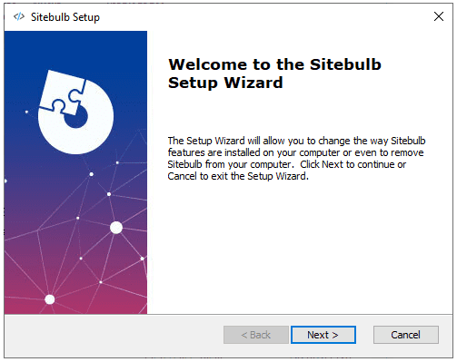
The fact that it is desktop software means that its performance will depend on the features of your computer.
It’s neither good nor bad, but something you should keep in mind when using it.
Also, it’s important to note that currently, there are only versions available for Windows and Mac. In this aspect, web applications have an advantage.
However, since Sitebulb requires minimal processing and storage resources on external servers, its license prices are quite affordable.
And that is definitely a very positive point.
Sitebulb and its Free Trial
When evaluating any paid software, it’s a good idea to use a trial version to decide if it’s right for us. Sitebulb makes it easy by offering a free 14-day license to evaluate all of its features.
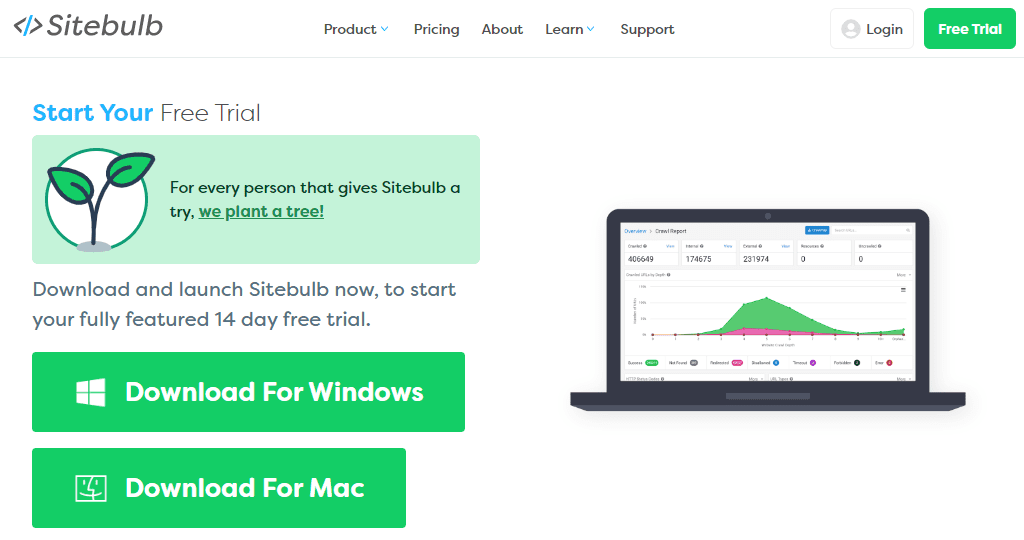
To get the license, you simply need to provide them with an email address. In exchange, they will plant a tree for you, helping to offset the carbon footprint that using their software may generate.
It seems like a good deal 😃.
Setting up our first project
The first time we run the tool, after downloading and installing it on our computer, it displays a screen to log in to the Sitebulb website.
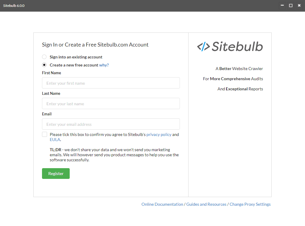
We can either use an existing account or create a new one. In this case, I’m going to choose the latter option, which will give me access to the 14-day free trial.
Once I’ve registered my account and logged in, I can see a list of all my projects.
Of course, since it’s a new account, it’s empty. So let’s create a new project.
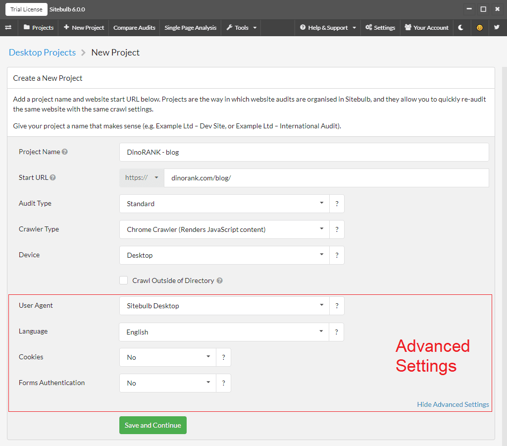
On the project creation screen, we must complete the following fields:
- Project name: we put a representative name so that we can identify it later.
- Starting URL: this is the URL from which the crawler will begin its tracking process. For this tutorial, I’m going to use the DinoRANK blog URL, as I’m only interested in analyzing that section of the website.
- Audit type: we can choose between Standard (crawls the entire website) or Sample (only crawls a representative part of the website to get a general idea of its state).
- Crawler type: depending on the crawler type we choose, we’ll be indicating whether we want to process the pages’ JavaScript (HTML Crawler) or not (Chrome Crawler). We choose yes, as we want to analyze whether search engines can correctly interpret the information.
- Device: we decide whether the response that our website offers for each URL is the desktop or mobile version.
- Crawl outside the directory: this option appears when you configure a directory in the starting URL. As we have indicated a second level of URL (/blog/), we must specify whether the crawler should crawl pages that are outside that directory or not.
In addition, we can configure some advanced options:
- User-Agent: with this parameter, we configure how the crawler identifies itself to our server, through the HTTP request headers.
- Language: the default language with which the crawler will make requests. It is important to indicate this if our website is multilingual.
- Cookies: whether we want the crawler to store cookies. It is not usual, but you will need to mark it if your website requires certain cookies to provide a correct response.
- Authentication: for websites that require a username and password to access.
When we press the button to continue, Sitebulb will perform some checks to see if it can access and crawl the website and, when finished, it will show us a screen to select the options for our website audit.
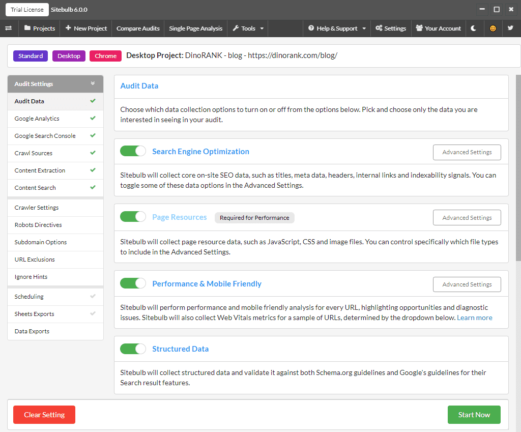
Here we have several sections with a multitude of aspects that we can configure, but to not make this part too extensive, I will only comment on the most relevant ones:
- Audit Data: we can choose which reports we want to be generated from the analysis of crawler data.
- Google Analytics and Google Search Console: Here we can connect our Google accounts to obtain more information regarding organic search traffic and visits received.
- Crawler settings: among other things, we can control the crawler speed by setting limits that will allow us to not overload our computer or the server where our website is hosted.
- Ignore Hints: if we are not interested in receiving warnings about some of the aspects analyzed in the different reports, we can individually deactivate them in this section.
- Scheduling: if we want, we can schedule the crawler to not run immediately after configuring the project, but on a specific date or periodically.
Finally, once we have reviewed all the configuration, our project will be created.
If we have not specified a specific schedule, when we confirm our options, the crawler will start crawling at that moment.
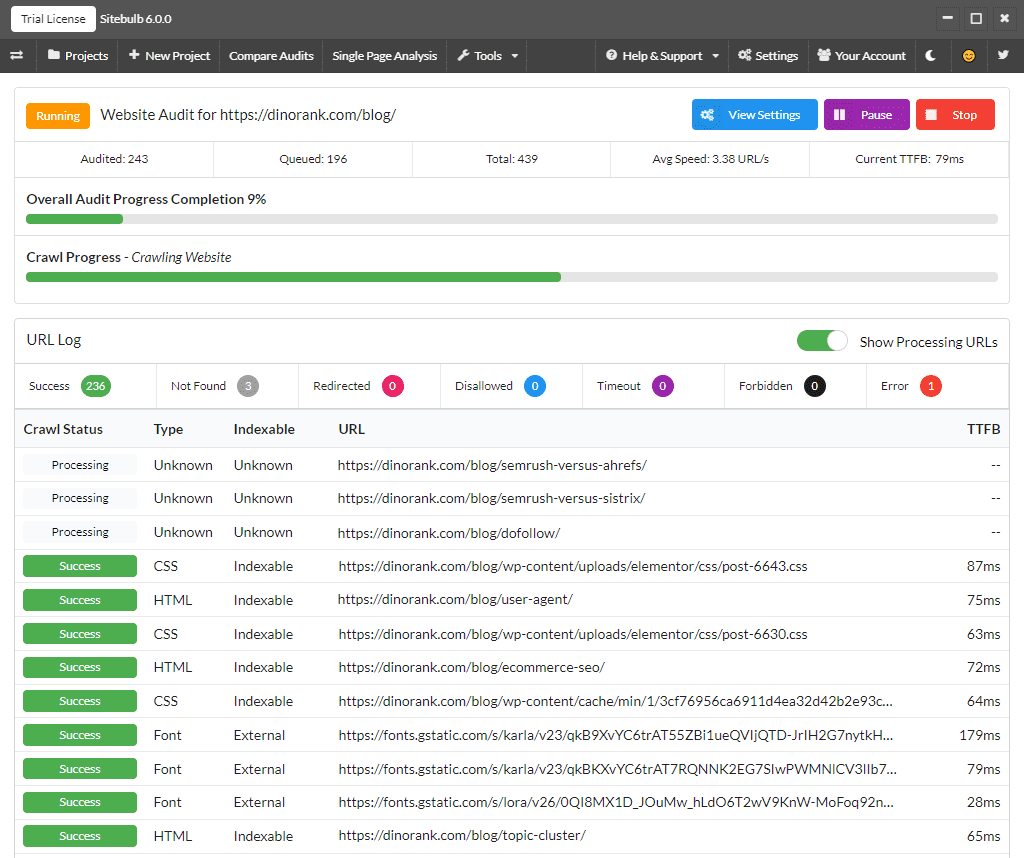
Depending on your computer’s configuration, the size of your website, and other tasks you may be performing on your PC, this process will take more or less time.
In our example, for the DinoRANK blog, it took about 15 minutes to complete the entire operation.
You can either watch the screen and see the progress of the crawl in real-time or minimize the window and wait for it to finish.
In any case, once it’s finished, it will display the results on the screen, and you can access all the audit reports.
A look at the Sitebulb interface
We now have our first audit and can start analyzing all the results one by one.
But first, it’s important that you understand how the tool is organized, as almost all screens have a similar structure.
This will make it easier for you to navigate through the large amount of data and tools available to you.
Therefore, in the following screenshot, you can see the main sections identified with boxes that you can find in most screens of the application.
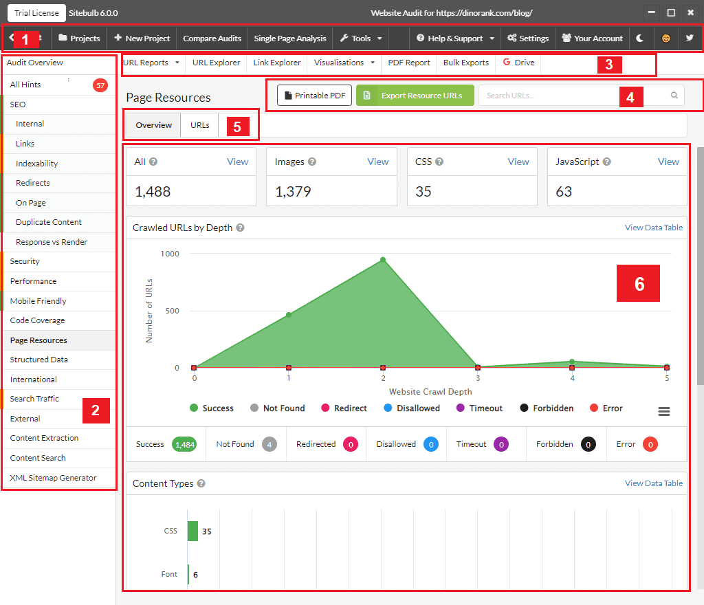
The top section (section 1) contains the main Sitebulb menu. From here, you can go to the project list, create a new project, compare audits, perform individual page analysis, use certain additional tools, or configure your settings.
The sidebar (section 2) contains a list of all the reports from the audit of your website.
Section 3 gives you direct access to data in table format, both for the URLs collected and for the links.
Additionally, from here, you can also access the graphical visualization of the website’s structure, generate a PDF with the audit reports you want, or export the data to a CSV file or directly to your Google Sheets account.
Sections 4, 5, and 6 are specific to each report. Their content may vary from one report to another, but they generally contain the following:
- Section 4: Export options and specific search for each report.
- Section 5: Tabs to access report views. The most common are Overview (view with data graphics), URLs (table with URLs referenced in the report), and Hints (warnings and improvement recommendations).
- Section 6: Representation of the actual information (graphics, tables, etc.).
Overview of the crawling results of your website
Now let’s move on to the first two reports of the crawler.
These are the Audit Overview and All Hints reports.
I wanted to group them together in the same section since, between the two of them, you get a pretty complete picture of your website.
The Audit Overview screen, as the name suggests, provides a general summary of everything collected by the crawler.
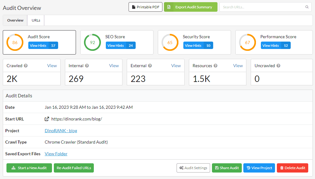
At the top, we see a series of scores. These are ratings that Sitebulb assigns based on its own metrics to give us an idea of how optimized our website is in different aspects.
Next, we have a summary with the total number of URLs collected, internal and external links, non-HTML resources (images, CSS, etc.), and addresses that could not be crawled.
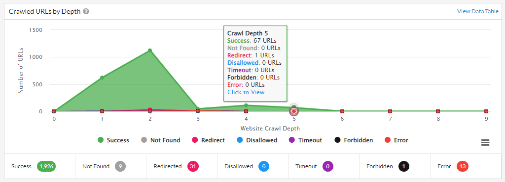
Finally, after a section with details about the crawler’s configuration and the technologies identified on our website, we have a series of very interesting graphs that show:
- The URLs collected according to their depth (distance from the URL configured as the crawler root).
- The percentage distribution of response codes.
- The distribution of pages according to their typology.
- How the crawler located the URLs: through the crawling process from the root page, because they appear in the site map (sitemap), through Google Search Console or Analytics, etc.
- The distribution of page content types.
On the other hand, the All Hints report is a compilation of all the identified improvement recommendations for our website.
We can group these recommendations by their importance or by the report they refer to, as well as filter them and show only those of a specific category.
Of course, we can consult or export the list of all the URLs to which each issue refers, in order to take the appropriate corrective measures.
And, in that case, we can mark as resolved those items that we have fixed.
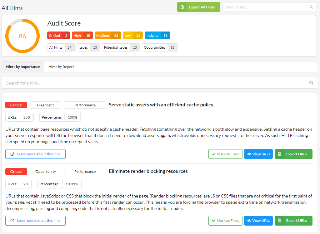
This screen is an example of Sitebulb’s team concern to facilitate the understanding of the results, even if you are new to the world of SEO.
There are many tools in the market that identify errors, warnings, and improvement suggestions. But most of them simply label the problem in a few words.
Sitebulb shows the user a very comprehensive description of each recommendation and, in case there are still doubts, offers a link to a section of their website where they have compiled all these recommendations and explained them in depth.
SEO analysis
Once we know the general state of our website, it’s time to dive into the details.
Although all the reports are important, the section specifically dedicated to SEO is the one we will probably pay the most attention to.
If you click on the section labeled SEO, you can see again the score that Sitebulb assigns to your website from this perspective, the redirects for the www and http(s) versions of the root page, and your website’s behavior when encountering 404 errors.
In addition, you will have direct access to all the recommendations to improve the SEO of your website.
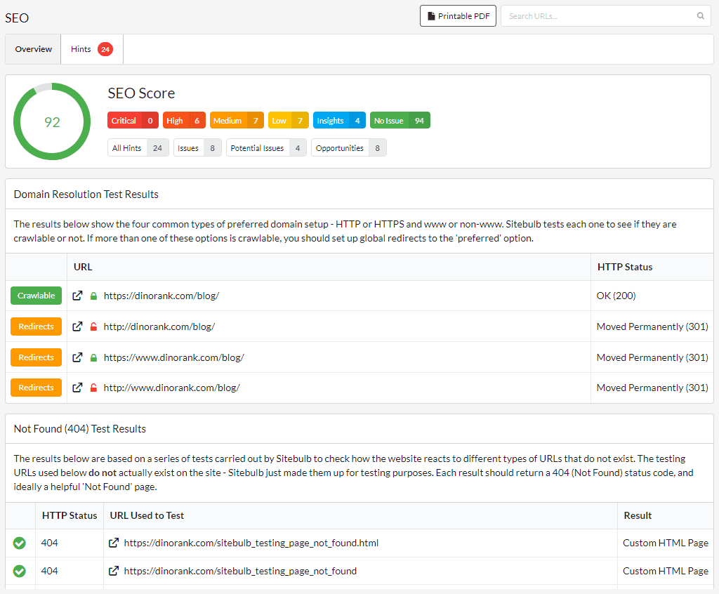
But this summary screen is not the most interesting one, as all the reports that are grouped within this category are of greater interest.
Let’s take a look at them.
Internal URLs
Review The Internal panel provides us with information about all the URLs that the crawler has been able to collect within our website.
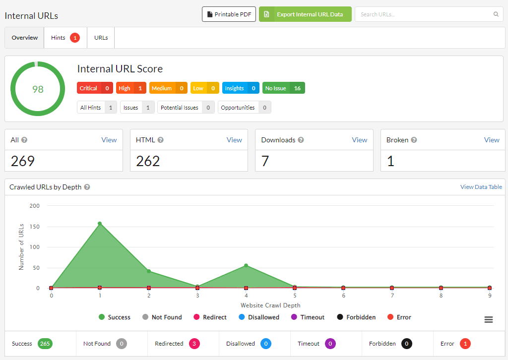
Once again, we have a score calculated by the tool that allows us to quickly assess the health of our internal URLs.
We also have a brief summary of the total number of URLs collected, how many of them are HTML pages or other types of resources, and the broken links that we need to fix.
If we want to see the list of URLs that these numbers refer to, we just need to click on the View option next to each of them.
Finally, there are a number of charts that show us:
- The type of response of the URLs based on their depth levels.
- The distribution of response codes.
- The sources through which the crawler has found the URLs. HTTP vs HTTPS protocols.
- Proportion of paginated URLs versus non-paginated ones.
- Distribution of content types.
Website linking
As SEOs, we know that linking is one of the parts we must take care of the most so that search engine robots can crawl our website and understand the relevance they should give to each of our pages.
Thanks to the Links panel, we can achieve excellent control over the incoming and outgoing links of the website.
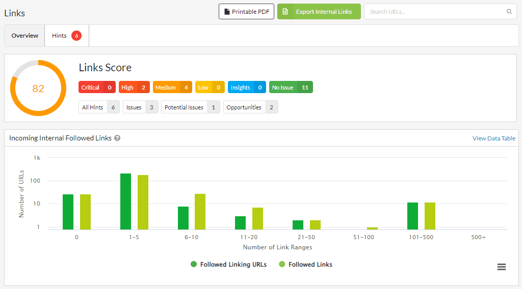
Just below the rating, we have a graph that offers us a lot of useful information.
It represents the URLs of the website grouped by the number of links they receive and the number of pages that link to them.
Usually, the most important pages should receive a greater number of links, so this graph allows us to know if there is any URL that we should enhance through our linking strategy.
The link report provides us with much more interesting information, but due to its usefulness, I want to focus on the URL Rank (UR) table.
The table at hand shows URLs grouped by UR and classified according to their response codes, depth level, and indexability.
In this way, we can locate and correct pages that receive many internal links but have incorrect response codes, are far from the root page, or are marked as noIndex.
External links
Although this report is not grouped within the SEO category, I think it’s no surprise that I mention it in this section.
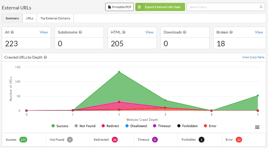
In the External panel, we have a global view of all the outbound links from our website with graphs that show us the response statuses and content types, as well as a tab with all the external domains we are linking to.
This way, we can easily identify problematic links and remove or replace them with others.
Indexing
Another key factor in appearing in search results is controlling the indexing of each page on our website.
The Indexability report provides a comprehensive view of this issue.
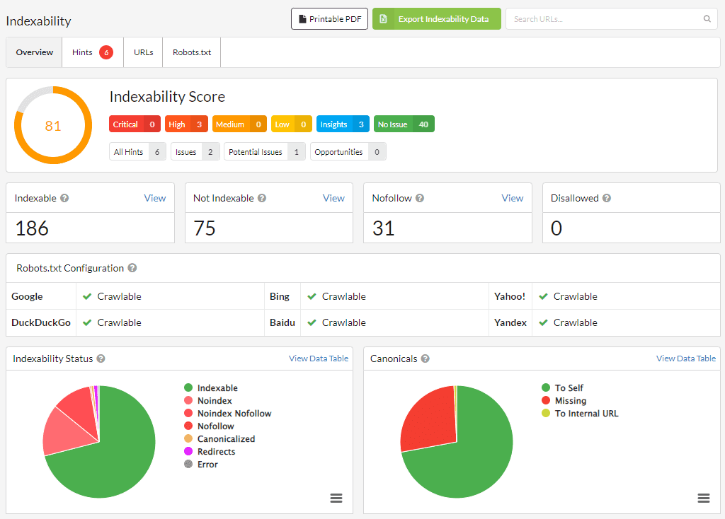
In a very visual and intuitive way, we can learn about pages marked as index, noIndex, or noFollow through the Indexability report. It also provides information about canonicals or blockages caused by the robots.txt file.
An aspect to highlight is the location of orphan pages, that is, those URLs that are not directly linked by others, but that the crawler has found through other means (for example, a redirect).
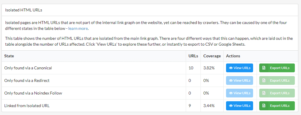
As always, all suggestions for indexing improvements are grouped together in the Hints tab.
In any case, remember: the tool provides you with the information. Then you have to be the one to decide what actions to take.
Redirects
In this report, we can see all the redirects, both internal and external, of the links contained on our website.
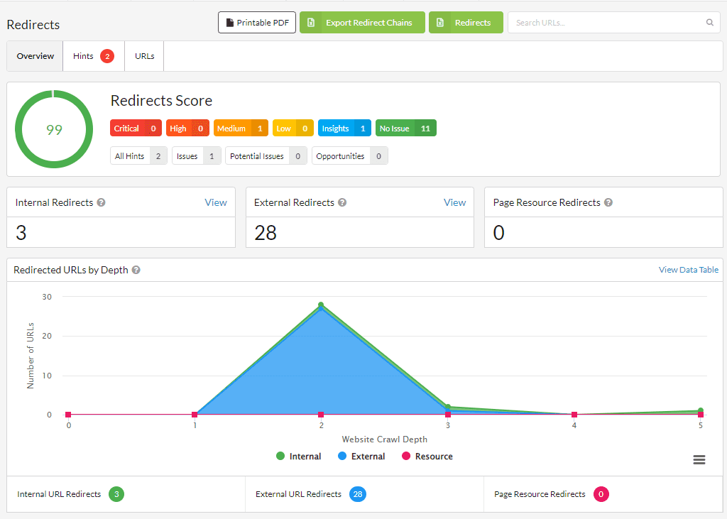
I find the topic of external redirects particularly relevant.
Typically, an internal redirect is something we’ve intentionally done to improve our website’s SEO.
However, we don’t have that level of control over external URLs, and it’s possible that they no longer point to the content we intended to link to.
That’s why it’s good to be aware of it and take action accordingly.
SEO On Page
This report focuses on website content and, specifically, on the elements that are most important to Google in interpreting the topic of each page.
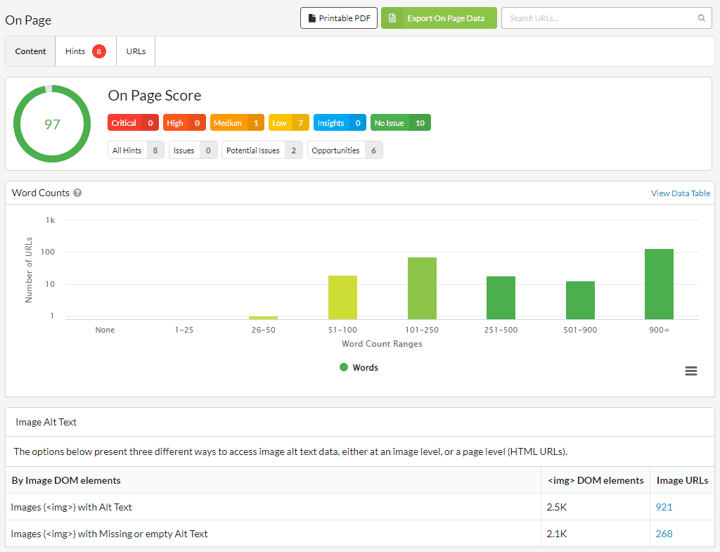
In particular, the information that you can extract from this report is as follows:
- A classification of pages based on the number of words in their content.
- The use of the Alt attribute of images.
- Analysis of titles, meta descriptions, and H1 headers.
Among the results obtained for the DinoRANK website, I was struck by the fact that there are some URLs with more than one H1 header. This is something that undoubtedly needs to be corrected.

Duplicate Content
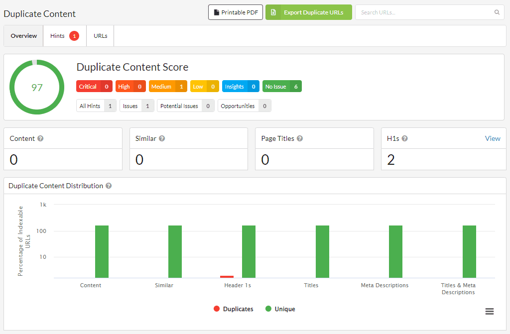
Continuing with website content, this time it’s the turn of duplicate content.
Through this report, we can analyze the duplication of text in titles, meta descriptions, H1 elements, as well as in the actual content of the pages.
Differences in Page Rendering.
The Response vs Render report informs us about the changes that occur when the JavaScript of the pages is interpreted.
To enable it, we had to select the corresponding option during the initial configuration of the crawler.
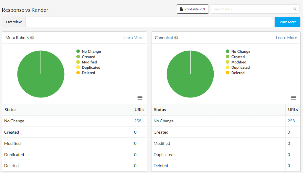
It should be noted that Google may interpret these discrepancies as an attempt to deceive the search engine or the user, so ideally they should not occur, and if they do, we must carefully analyze them to see if they make sense.
Performance
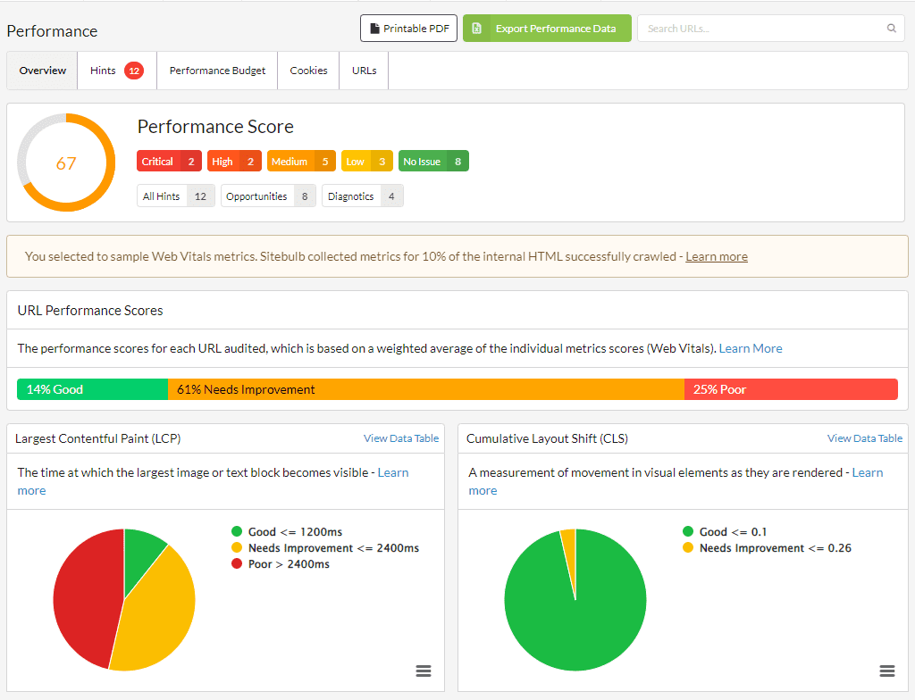
As with the External section, the last of the reports that I consider to be most closely related to SEO is also located outside of the SEO section of the tool.
This is the Performance panel, which offers us a view of the website’s loading speed from the perspective of Google’s Core Web Vitals.
We have a column that indicates the page where each link is located, and another column that displays the destination page it is linked to.
In addition, we have highly relevant information about each link, such as its anchor text, location on the page, whether it is a follow or nofollow link, and more.
Site Visualization
They say a picture is worth a thousand words.
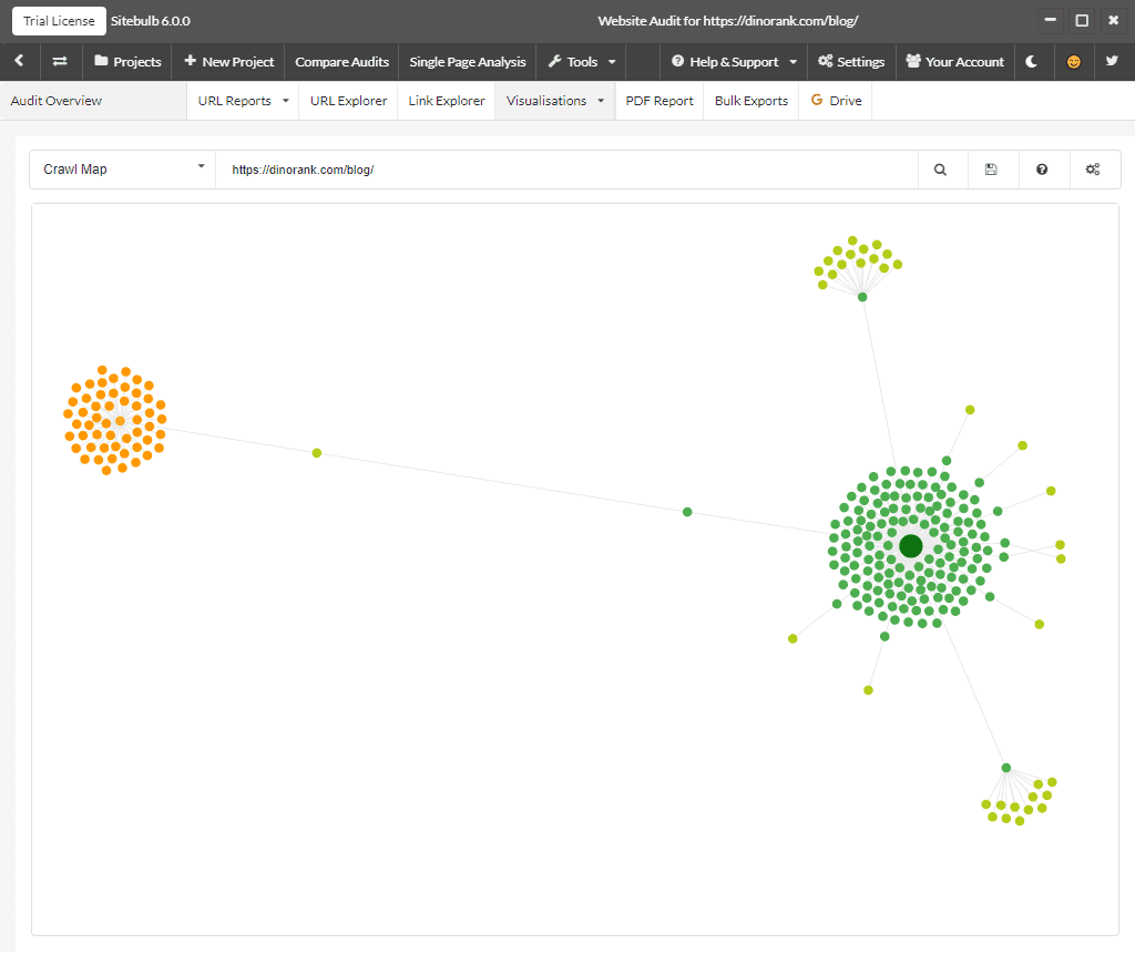
Sitebulb has integrated a graphical representation of your website’s architecture in various formats (map, tree, and radial) from two different viewpoints. They say that a picture is worth a thousand words, and that’s why this feature is so valuable.
Firstly, we have the representation of URLs from the crawler’s viewpoint. The central point will be the page that we have configured as the root for the crawler, and the branches will indicate the distance to the rest of the pages through link navigation.
This way, we can determine if there are URLs that we’re not giving enough relevance to, simply because they’re not close to the root.
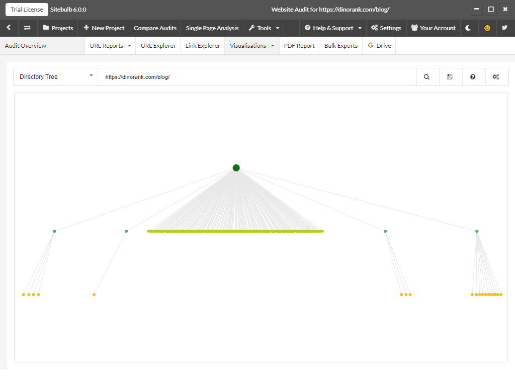
On the other hand, we have the representation by directories.
In this display mode, the tool shows us the organization of the pages by URL levels.
This depth level graph is very useful to check if any page is not in the place it should be according to the architecture we have defined for our website.
How much does Sitebulb cost?
If you ask me if Sitebulb is an expensive or cheap tool, I would say that, in my opinion, it is a fairly affordable application for everything it offers.
The cheapest version costs $13.50 per month (slightly less if you opt for the annual plan) and allows you to create unlimited projects with a restriction of 10,000 URLs per audit.
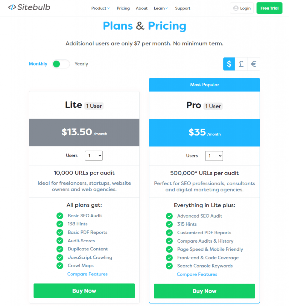
In addition, there is a Pro version that increases the previous limits and adds other more advanced functionalities.
However, if you are a team and want to use your own Sitebulb account, you will have to add additional licenses at an extra cost.
Sitebulb Server
We should not confuse Sitebulb with Sitebulb Server.
Sitebulb is the desktop tool that I have described in this guide so far, designed for use by any SEO specialist, regardless of their experience.
Sitebulb Server, on the other hand, is the new solution that Sitebulb developers have come up with to combine the best of desktop crawlers and cloud crawlers.
It is a software that you install on a server to take care of executing all the crawling and information storage processes.
Then, users will connect to this server through their Sitebulb installations and will be able to share information among them.
Sitebulb Server is designed for teams of several SEO consultants or specialized agencies, as its deployment requirements are not within everyone’s reach.
On the one hand, you need a dedicated machine with certain minimum specifications. It can be owned or contracted from an external provider.
On the other hand, you will need to purchase a Sitebulb Server license, as well as a Sitebulb Pro license for each user who wants to use the service.
However, given that the processing power is on your end by setting up the server, these licensing costs are generally cheaper than most web-based crawlers.
Sitebulb Server provides the following advantages:
- A centralized repository of all Sitebulb audits.
- Access from anywhere.
- Site crawls with up to 5 million URLs.
- Ability to run multiple crawlers simultaneously.
- All the benefits that Sitebulb Pro already offers.
As you can see, it’s not a solution for everyone, but it can be a very useful SEO tool for teams with multiple people.
Sitebulb vs Screaming Frog
When talking about Sitebulb, it is almost impossible not to think about perhaps the most well-known SEO crawler.
I’m referring to Screaming Frog.
Doing a thorough comparison of both SEO tools would make for an article almost as long as this guide.
That’s why I’m simply going to quickly summarize the advantages of one and the other, so you can get a general idea of which one is more appropriate for your needs.
The reasons for choosing Screaming Frog would be the following:
- It’s a well-known tool, for which you can find many tutorials on the internet.
- The amount of data it can collect and analyze is overwhelming.
- The crawler is a bit faster.
- It has a free version that allows you to crawl up to 500 URLs.
- The paid version has no limits on the number of pages to analyze
On the other hand, the main advantages of Sitebulb over Screaming Frog are:
- It offers a better user experience, thanks to its interactive graphics, reports, and the way it presents all the information.
- The improvement recommendations it shows are very detailed and easy to understand.
- The basic license is slightly more affordable than the paid version of Screaming Frog.
- The cost per additional user is lower.
As you can see, there is no clear winner. Each tool has its purpose, and both are excellent solutions for analyzing the internal structure of your website.
Sitebulb: Final thoughts
Sitebulb is one of those tools that could easily be part of any SEO specialist’s kit.
Thanks to this desktop crawler, we’re able to audit websites with a high level of detail and obtain a set of concrete actions to take relatively easily.
It’s an application that has its strong points in its complete and intuitive reports.
Whether you specialize in creating niche pages or you’re an SEO consultant who works with client websites, Sitebulb makes it much easier to analyze those technical aspects to help you improve your search engine rankings.

